Introduction
In the healthcare industry, quality control is a non-negotiable priority. Institutions are in constant pursuit of methods that can enhance the quality of patient care. One such method gaining traction is the use of control charts in healthcare quality improvement.
Did You Know? Control charts were first developed by Walter A. Shewhart in the early 20th century while he was working at Bell Labs.
What Control Charts Offer
- Identification of process variations
- Real-time data tracking
- A way to distinguish between special cause and common cause variations
- Statistical methods for process improvement
What are Control Charts?
Control charts, also known as Shewhart charts or statistical process control charts, are a graphical representation of a process over time. They are integral in Six Sigma methodologies and are effective in identifying process variations, thereby aiding in continuous improvement.
Why Use Control Charts in Healthcare?
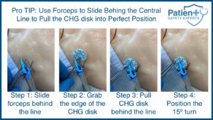
- Ensure safe central line placement by monitoring variations.
- Monitor and optimize a sepsis program by understanding process performance.
- Establish process stability to reduce medical errors.
Types of Control Charts
Depending on the type of data you are dealing with, different charts can be utilized:
- X-Bar Chart: For process mean.
- R-Chart: For data range.
- S-Chart: Used when the sample size is large.
- U-Chart: For defects per unit.
- Poisson Distribution Charts (NP Charts): Used for rate-based measures.
- I-MR Chart: For individual observations and moving ranges.
For example, optimizing a sepsis program might require a U-Chart to track the number of infections per unit over a given time.
Key Terminologies
Understanding the language of control charts is essential. Here’s a glossary of terms you should be familiar with:
| Term | Definition |
|---|---|
| Standard Deviation | A measure of data dispersion around the mean. |
| Data Points | Inherent variations always exist in a process. |
| Lower Control Limit | Individual values are plotted on the control chart. |
| Upper Control Limit | The highest acceptable process variation. |
| Center Line (Centre Line) | The process average or mean value. |
| Process Variation | Variability in data over time. |
| Common Cause Variation | Inherent variations that always exist in a process. |
| Special Cause Variation | Variations due to specific, assignable causes. |
| Run Chart | A line graph showcasing data over time. |
| Process Performance | How well a process is achieving its intended purpose. |
Best Practices for Using Control Charts
Steps for Implementation
- Data Collection: Decide the sample size and type of data to be used.
- Choosing the Right Type of Control Chart: Choose based on your data type and what you intend to monitor.
- Set Control Limits: Utilize 3-sigma limits for the most commonly used control charts.
- Plot the Data: Put your data points, center line, and upper and lower limits on the chart.
- Interpret and Take Action: Apply statistical methods to identify possible causes of variations and take corrective action.
Do’s and Don’ts
- Do follow the Western Electric rules to interpret the data.
- Don’t ignore large shifts and small shifts in data.
- Do use central line safety programs when applicable.
- Don’t assume that the process is stable just because data points are within control limits.
Real-world Examples
Case 1: Central Line Safety Program
A healthcare facility noticed fluctuations in their central line-associated bloodstream infections. They used an X-bar chart to determine the process average and control limits. Through this, they isolated special causes that led to infections and were able to take corrective action.
Case 2: Improving Sepsis Outcomes
An X-bar chart was used to monitor the time taken to administer antibiotics to sepsis patients. Over time, the facility achieved a stable process with all data points falling within upper and lower control limits.
Conclusion
Control charts are an invaluable tool for healthcare quality improvement. They are versatile, offer real-time data monitoring, and, most importantly, help healthcare providers separate the ‘signal’ from the ‘noise.’ By understanding their terminologies, types, and best practices, any healthcare institution can utilize control charts to elevate their level of care.
Remember, the key to a successful control chart lies not just in plotting but also in its interpretation. A control chart is not just a graphical representation but a mirror to your process performance. The next step? Implement control charts in your healthcare facility and see the difference for yourself.
So, delve into the world of control charts and be part of a larger mission—continuous improvement in healthcare quality and patient safety.